Healthy Portions

For Healthy Cooking!

demo

Summary

User Experience Design & Branding

Healthy Portions is the ultimate recipe manager and cloud storage platform to provide a user experience that fits the needs of users to organized their healthy inspirations.

My Role

  • UX Designer
  • Visual Designer
  • Branding & Identity
  • Content Strategist

Deliverables

  • User Survey
  • Persona
  • User Stories & Flow
  • Competitive Analysis
  • Paper Prototype
  • Wireframes
  • User Testing
  • Visual Designing

Tools

  • Sketch
  • InVison
  • Figma
  • Usability Hub
View Mobile Prototype

Overview

Problem

The client wanted to enter to cloud storage market by designing a product that includes the features of saving web content, organizing, creating, and uploading files etc.
Users often find that recipe organization is complicated from all source in one place. It's not always obvious who you are sharing with or what access they have. Users having difficult time to remember substitute ingredients for restricted diet.

Solution

Healthy Portions aims to address these concerns by providing these features. My biggest design challenge was to offer users a way to quickly find interesting recipes and to search for subsitutute ingredients easily and edit the recipe according to their needs.
Healthy Portion design became more polished, clear, and user-friendly as it went through multiple iterations based on two rounds of Usability Testing, Preference Testing, and feedback from senior designers.

Assumptions

When it comes to cooking, users are divided into 3 groups :
1- People who never know what to cook .
2- People who plan their menu in advance and
3- The people in between who want to have a lot of ideas, but they need to make up their mind.

There are 3 main ways to make up your mind what to cook :
1- Use well-known recipes
2- Search them on the Internet
3- Experiment with the ingredients left in the fridge.

Along with most people, I happen to be the third type of person. Who is the general consumers of the fast-growing recipe storage market. Over the years, I have tried a few recipe apps, some provide big database of interesting recipes and their moderation other offers mobile apps because it’s easier to use them in the kitchen. So when prompted to create a cloud storage app I decided to put all of those great features together and see if anyone else shares my problems.

User Research

I began researching by creating a survey posted to multiple platforms. My survey focused on:


How respondents save and upload content using cloud storage.
How people share resources with their community.
Tools and services used to save, create, and collaborate on content.
Likes and frustrations with current solutions.


Here are the key findings of research survey, I took among the 20 students and young professionals between the ages of 18-40.

people-graphic

100% use cloud storage for recipe backup, file syncing, and real-time collaboration

people-graphic

62% found organizing content with categories are useful

people-graphic

50% currently creating recipe by using documents

people-graphic

62% participants currently access recipe from their mobile.

Personas

Now that we had determined a target audience for our product - cooking lover who want to try and like to eat healthy - we focused our user research on this group.I conducted interviews and created a user personas for a stay at mother who love to eat healthy and feed her kids healthy and a Marketing Advisor who is a home chef too, he likes exploring new recipes but from his busy life he want to have a more efficient way of meal preparation.

View designed personas here

Monika

Monika


Age: 36 years old

Occupation: Stay at home mom

Location: Florida


Goals

I want a service that can replace my notebook, want to get real time synchronization within all devices and able to share recipe with my husband.


Quote

“I am stay at home mom, so if I’m not working,I’m taking care of my kids and health. On my clock every minutes counts and if I didn't find something on time, it's easy to get behind.”


Frustrations

Thinking what to cook ? Finding healthy recipes again from her notebook. Finding alternative for special dietary needs like vegan, gluten-free, and low carb.

Anderson

Anderson


Age: 29 years old

Occupation: Marketing Advisor

Location: Phoenix


Goals

I Want to have a more efficient way of meal preparation and explore healthy recipe with honest reviews without having to search,so that I can manage my time spent during cooking.


Quote

“I like exploring new things and meal planning is very exciting to me but it can also be draining at times as well. I can't find the motivation to eat healthy or work out more”


Frustrations

Finding the correct food item through search is difficult. Hard to find recipe with substitute ingredients. Adding individual food items cumbersome and time consuming.

Competitive Analysis

This information allowed me to see potential gaps in current services and untapped opportunities for a new product. The battle for the cloud storage market may not be life and death, but it is important to know one’s or competitors when creating a product. Big Oven and Epicurious are big names in recipe cloud storage while Pinterest has carved out its own niche by providing something unique. I performed a SWOT analysis of these three competitors.

View Complete SWOT Analysis

Pinterset

Pinterest is a intuitive service focused on saving online content. It has limited organization, storage capabilities, and security.

BigOven

BigOven is expert at organizing and collecting recipes. It has limited file uploading tools and the navigation can be confusing to users.

Epicurious

Epicurious is known for its simple interface and collaboration but limited organization tools, and restricted functionality are their weaknesses.

User Stories

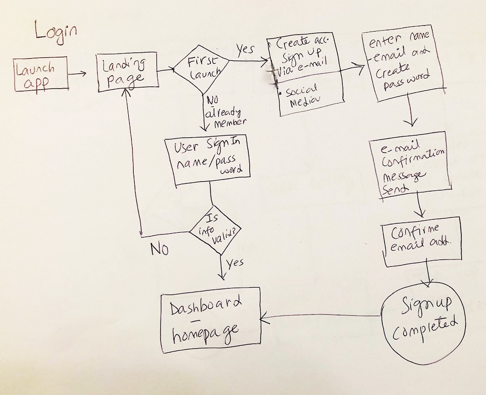
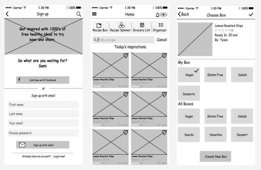
To establish necessary features, I created a list of user stories based on potential user tasks. These user stories were refined and prioritized to define a minimum viable product. To map out the interactions of the main features, I listed user stories as;


  • As a user, I want to download the app on my mobile phone.
  • As a user, I want to create a new account.
  • As a user, I want to be able to login with google account/Facebook.
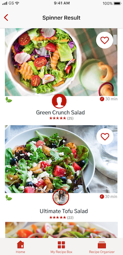
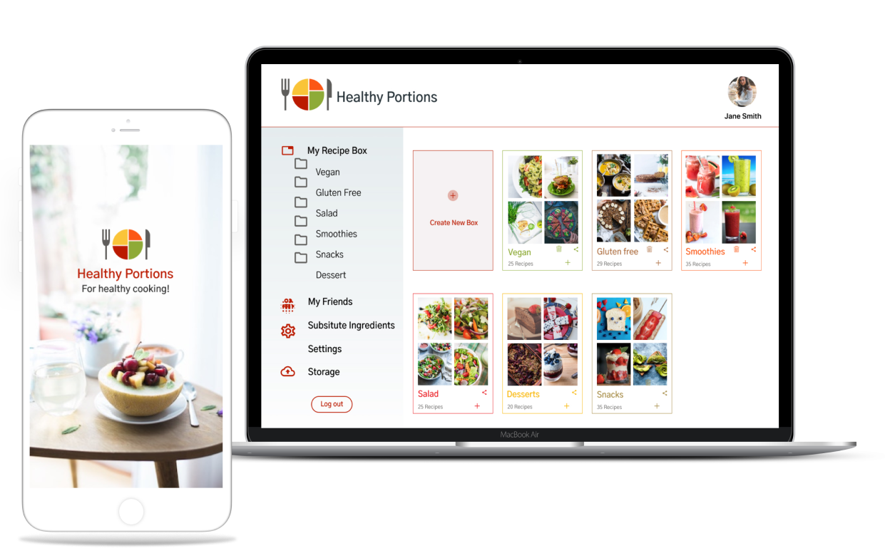
  • As a user, I want to creating content, like notes, meal plan, recipes
  • As a user, I want to save recipe or health tip I found on the web.
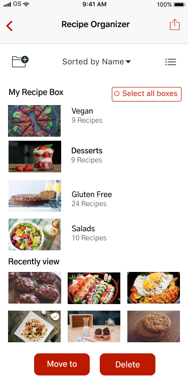
  • As a user, I want to edit my meal plan.
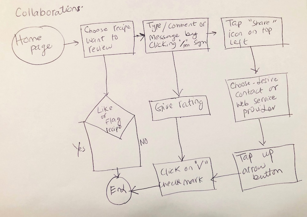
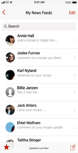
  • As a user, I want to share events/recipe with my friends/coworkers because I found it useful.
  • As a user, I want to organizing that content using things like categories,tags, groups, and/or folders.
View All User Stories

Userflows & Site Map

The next step was to develop user flows.From user stories i was able to create user flow and site map. The process began with sketching out multiple iterations of the onboarding, uploading, upgrading, organizing, and collaborating user flows. Using the user flows, I began to layout the content strategy by creating a sitemap and planning content for each area.


View Site Map

organized

Branding & Identity

Through the help of some mind-mapping techniques and number of words associated with what the product should convey, I came up with a name that has a lot of potential to create a strong brand “Healthy Portions”.

Based on the analysis of my user surveys and alongside my personas, “Healthy Portions” is a strong brand to serve the demands and address some of the problems that are currently arising from a potentially new and growing market of users in the cloud storage space.

Logo

As a recommended healthy portion size is the amount of each food that you are supposed to eat during a meal or snack. USDA has provided a variety of nutrition guides and divided a plate into four section. Keeping all these in mind, I come up with the idea of a portion plate for logo. A Knife and a Fork beside a plate help visualize the actual “Healthy Portions”.
I made sure that our logo combination must pass the WCAG AA test (for the people with color vision deficiency).

logosketch
logo-group

Color Palette

Typical color schemes which are relevant includes the use of Greens as Vegetable , Browns as Whole grain,Yellow as Healthy Proteins and Orange as Fruits, along with the use of element colors to add more character to the logo.

color palette

Fonts

fontawesome

Wireframing & Testing

Low Fidelity Wireframes


As with the User Flows, I started designing Wireframes with pen and paper first. I created 4-Up sketches for each screen I was going to need. I wanted to try different versions of each screen, but I also wanted to make navigating the app as simple and clear for users as possible.


View all Wireframes
Wireframes
A&B Testing

oraganizer organize

100% of users liked the screen with food images over the other because it is more interesting and they can see what they going to eat or try. When the High fidelity mockups were done, I was able to test them with a few people to collect some more feedback. Most of the comments were about how it may be confusing to organize a recipe so made some last changes to the visual design bellow.

User Testing

The primary purpose of the usability test was to determine the usability strengths and weaknesses of the Cloud Storage app “Healthy Portions”. The test also asked questions about the branding communication. Users interfaced with a Hi Fidelity Mockup prototype test created using Figma, InVision, and Maze design.
The full test report can be viewed here:

InVision prototype
Maze user testing

I applied the changes to reflect the most popular choices from user test.

Final Product

Applying suggestions based on user testing, I created the latest version of “Healthy Portions”.I stayed focused on the target of creating a cloud data storage service while applying branding to reinforce the product identity and applying usability changes with real users in mind. These screens can be viewed here;


Conclusion

User Surveys proved to be very beneficial in providing a focus on creating our product. Researching User Flows for competitors was also helpful in guiding us on what screens and modal windows to create. Users responded positively to the line illustrations of the final design. Feedback from senior designers, Usability Tests, and Preference Tests helped me to fine-tune visuals and specific elements of UIs. Perhaps the biggest changes made throughout the design process was organizing screen evolution. The rounds of Usability Testing revealed tasks, instructions, or processes that seemed clear to me, but were not so clear to different users. This helped me to see and realize things I could not surmise on my own. The Preference Test helped me to make design decisions that were challenging to make on my own.

Lesson Learned

It was both challenging and fun to design “Healthy Portions” from start to current finish product. Throughout this process, I learned that the more testing you can do the better, and it's okay to love an idea, but you have to be willing to let it go too.Lastly, I learned that it is more important to have finished good enough project than an unfinished “perfect” project. it’s amazing how helping my users give me a new, humbling perspective on my own goals,designing products that positively impact and serve the greater good.